
We all remember the great wrestling title belts, from the Winged Eagle to the Big Gold, and everything in between. But sometimes, the “in between” is where some truly awful title belts come to be. That’s why we’re taking a look at the worst wrestling title belts…in my opinion, at least.

5. FTW World Championship
What’s there to say about this belt? It’s a classic “winged eagle” belt with stickers on it. Yes, I said stickers. When Taz lost the WCW Television Title to badass and tattoo-enthusiast Bam Bam Bigelow, he decided that he would create his own title (with blackjack and hookers), thus came the FTW (F$#@ The World without the symbols) World Title, which is a belt he created, was one of only two champions to ever hold it, and the first version had stickers on it. There would be a second version of the belt that looked much better, but this one is just bowling shoe ugly.
 4. The “ECW” Title
Now there are many ECW Titles you could argue aren’t that great. From the original ECW having a title with an indecipherable font to the abomination directly about this sentence. Yup, this was the 2nd version of the WWECW World Championship. First, it mentions WWE on the main plate twice, and the WWE logo on the side plates, with a mention of it being the ECW belt only once, and oh yeah, it looks like a belt you’d create on a WWE 2K game. If you were drunk. There’s really nothing redeemable here.

3. The Jeff Hardy Immortal Belt
Speaking of being inebriated, I would like to know how much of what hallucinogen Jeff Hardy was on when he designed this title belt. Now, on the surface, I actually agree with the customized title belt when it fits the character. Stone Cold Steve Austin’s “Smoking Skull” belt made total sense at the time, but designing, making, and wearing this belt is just a bridge too far. There’s nothing on this that even hints that it’s a world title belt. Except for TNA on the forehead (can’t believe I just typed that), which doesn’t make it any better. This belt was replaced rather quickly, as it should have. Because what the hell?

2. The Divas Championship
This is a tramp stamp. There, I said it. There is nothing about this belt that doesn’t scream “Florida night club girl who will do degrading things for a Mike’s Hard Lemonade”. Ostensibly, it’s supposed to be a tribal butterfly, I guess. But that’s not better. Add the WWE logos with basic Photoshop brushes on the oddly shaped side plates isn’t making it any better. Say what you want about the Women’s Championship design before it, but at least it looked like a legitimate title. This just comes off as demeaning, like something they’d design for women to make fun of them. “Here’s your title, little lady. Now get me a coffee”.
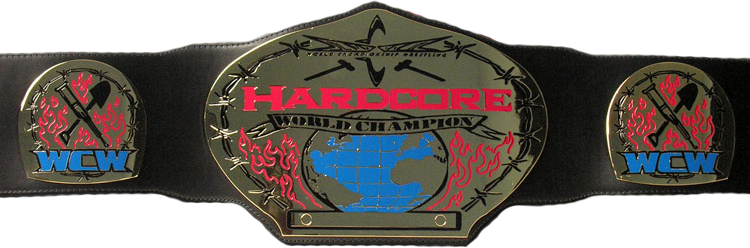 1. WCW Hardcore World Championship
Ugh…I just can’t. If the tramp stamp title wasn’t bad enough, WCW had to retroactively lower the bar with this 5 minute rush job of a title. Like the designer was given the important job of designing a title belt that would be seen on national television, then remembered they worked for WCW and completely phoned it in. The side plates are just crappy flames and generic weapons on it. It actually looks like it was hand drawn. By me. Which is a terrible idea.
Then there’s the main plate, which adds barbed wire, more crappy flames, sledgehammers, the actual WCW logo at the time, and a globe. Why? I don’t know. But, to me, the most baffling detail in this hand drawn hodgepodge of a title is that the belt is flat. Think of every title you’ve ever seen, The Winged Eagle, The Big Gold, the classic Intercontinental title, all of them were textured. This one, this bad middle school sketch come to life, is completely flat. I literally can’t think of a worst title belt design than this. And this was for a division that used to have a trophy with a saw blade on it.


Leave a comment